Creative Direction
The Role of Typography in Modern Branding
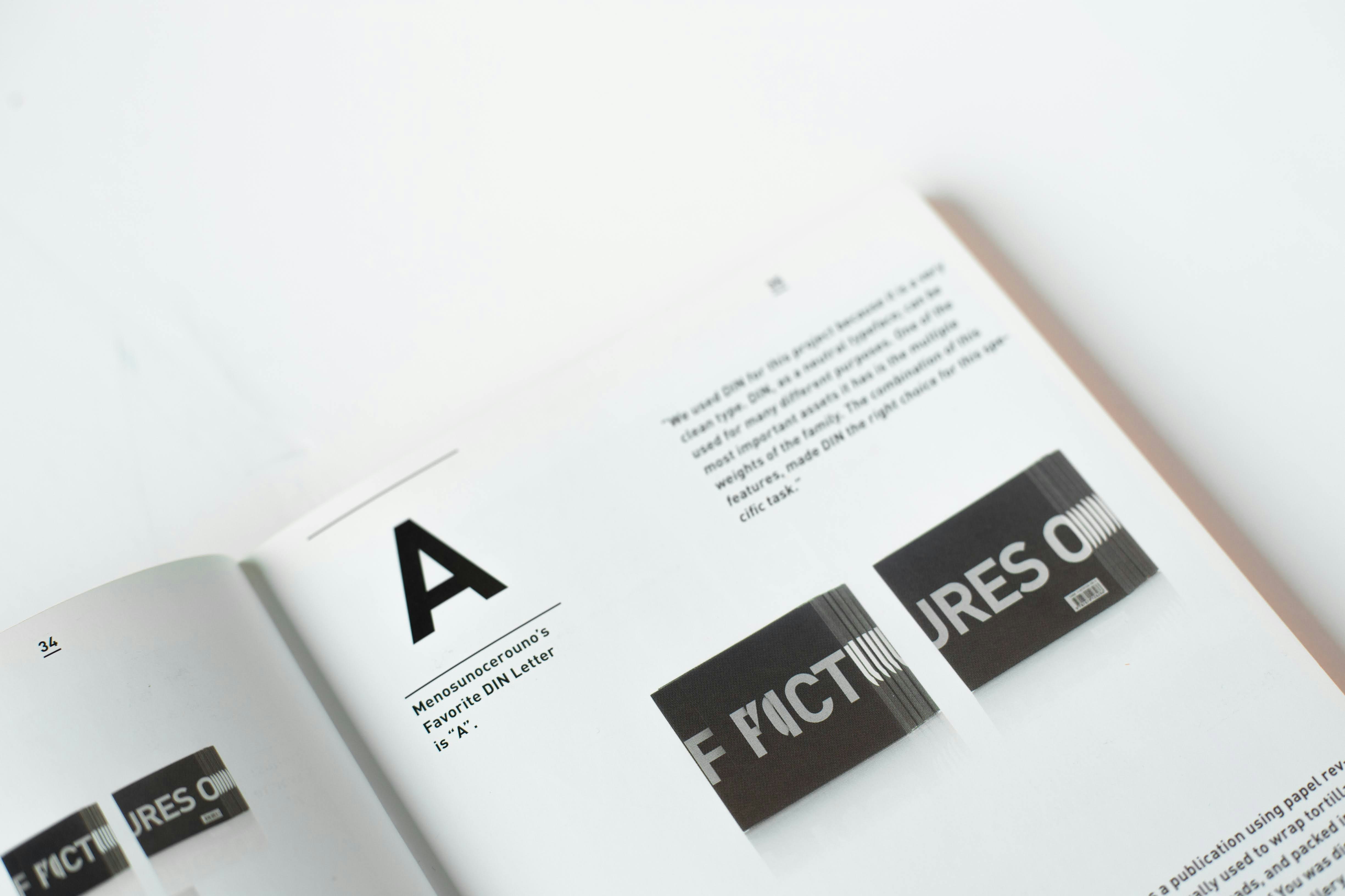
Typography is one of the most powerful tools available to designers, yet it is often underestimated.
Before a user reads a single sentence, typography begins communicating. The choice of typeface influences perception immediately. It can make a brand feel sophisticated, technical, creative, luxurious, approachable, or authoritative.
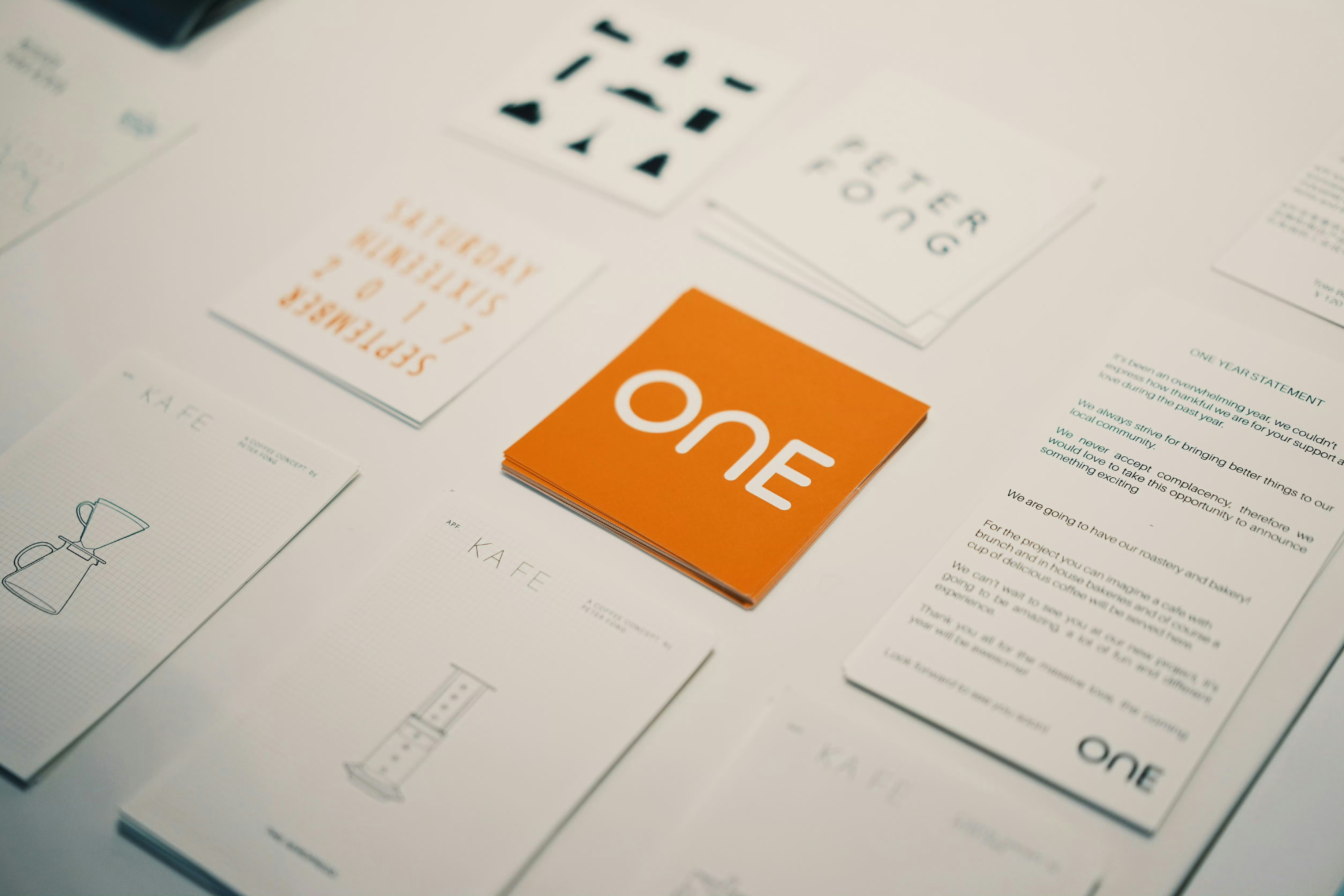
Strong branding systems often rely on typography as their primary visual element. In many modern identities, type does more than support content—it becomes the identity itself.
Typography creates hierarchy. It establishes relationships between information and helps users navigate content efficiently. Headlines, subheadings, body text, and supporting information all serve different purposes. Without a clear hierarchy, even the most beautiful designs become difficult to understand.
Beyond functionality, typography contributes to emotional impact. Large editorial headlines create confidence and presence. Refined serif systems communicate elegance and heritage. Contemporary sans-serif systems often suggest innovation and simplicity.
Consistency is equally important. A carefully structured typography system allows brands to communicate across multiple platforms while maintaining a recognizable voice. Whether viewed on a website, presentation, social post, or marketing campaign, the experience should feel unified.
The most effective typography choices are rarely based on trends alone. They are based on context. Understanding audience expectations and brand positioning helps ensure the selected type system supports long-term goals rather than short-term aesthetics.
In many cases, typography becomes the strongest visual asset a brand possesses. It influences perception, shapes communication, and creates a foundation for everything else that follows.